
This morning, SportsLogos.net reported that the Leafs will be redesigning their logo and jerseys for the 2016-17 season. The team hasn't made a change to their jerseys since they introduced their current thirds in 2011. They haven't changed their primary logo at all since 1987. Maybe they're due for a change.
So, with a re-brand on the way, let's take a look back at some of the best and worst Leafs jerseys from the past 99 98 seasons.
The Good
Winter Classic jerseys
via Gegory Shamus/Getty Images
These are probably the best Leafs jerseys in recent memory. They're a really great callback to the late 1920s and the early days of the franchise. They didn't try to reinvent the wheel with these: the logo is classic, the design is clean, and the multiple stripes on the bottom and arms really make the jersey pop.
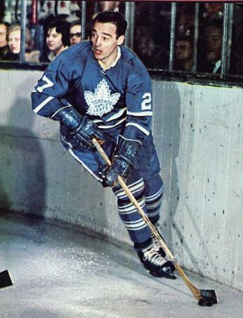
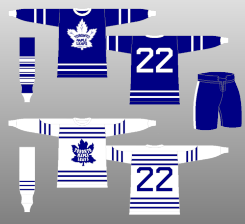
The 1962-63 jerseys
These jerseys are beautiful in their simplicity. The logo is classic, possibly the best they've ever had. If it looks familiar to you, it's because the Leafs brought them back for their thirds in the 2000s before they moved on to their current logos, which borrow from the 1967 Leafs. The rest of the jersey is clean--the stripes are where they should be and the designers didn't try to do anything fancy. The only thing that I'd add to the original design is a nameplate.
The Bad
The 1934-37 Whites
Despite being around for close to a century, the Leafs haven't worn very many bad jerseys. These whites from the 30s, however, are not good. Those stripes are just...too much. They look more like prison uniforms than hockey jerseys.
The 1945-48 Darks
I'm not quite sure what the team was going for here. The red text is just odd. The rest of the sweater is great but the red lettering just throws everything else off. The Leafs should stick to the blue and white. No need to throw a third colour in the mix.
The Ugly
The Reebok Edge design
Yikes. The Leafs brought these jerseys out for the 2007-08 season and kept them around until the 2009-10 season. It's pretty hard to mess up Leafs jerseys but Reebok managed to do it with these. The lack of a stripe at the bottom makes them look like practice jerseys (or pyjamas), the numbers on the sleeves and the back are outlined, and the cuffs are not good at all.
I think the lessons from the ghost of Leafs jerseys past is clear: simplicity is best. Especially with logos as classic as the Leafs have used, there's no reason to go needlessly complex by doing weird things with stripes or adding colours. At this point, the design language of hockey jerseys has already been established--we already know what works and what doesn't.


Comment Navigation & Markdown
Navigation
cc to focus on comments section
c next comment
x previous comment
z next unread comment
Inline Styles
Bold: **Text**
Italics: *Text*
Both: ***Text***
Strikethrough: ~~Text~~
Code: `Text` used as sarcasm font at PPP
Spoiler: !!Text!!