
My grandparents had a dog who was so horrible he was wonderful. He was old, short, fat and grumpy. He had a dent in one eye, teeth that stuck out at odd angles and he smelled bad - so bad, that the cat would eventually decide to bath him herself just so she could tolerate his presence. He'd let anyone into the house, then bite you in the ankles on the way out. The grandkids, of course, loved him. Best dog ever.
Some card sets are the same way. They're so bad that they actually become kind of compelling. Some feel that way about the initial Pro Set attempt - the set where every other card had the name misspelled and the rest had factual errors. That's not really one of my favourites (I can't get that enthralled about "Ray Borque") because it's badness was more a factor of being rushed to market and general sloppiness. The badness I like is more the "what on earth were they thinking?" variety, badness that was actually meant to be good.
One blog I like published the five elements of good card design. The list is as follows, derived from 1954-56 Topps baseball, the cards he cites as the standard-bearers of good design:
1. The player image dominates the appearance of the card
2. They use bright and vivid colors
3. The cards have defined borders (although the 1954 design works just as well as a full-bleed design because the background is a single solid block of color)
4. The player and team names are easily readable, and two of the three designs (1954 and 1955) also incorporate team logos
5. The card numbers on the back are easily readable
I don't have any examples of 1954-56 Topps baseball, but I've always liked 1965-66 Topps hockey for more or less the same reasons.
 |  |
Good cards are fun and look great when assembled together as a set.
However, check this out:
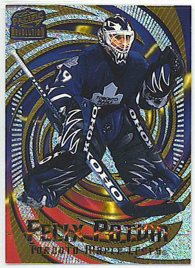
This is a 1997-98 Pacific "Revolution" card. Believe it or not, this was more of a high-end offering. It won't mean the same thing to everyone, but for me, it immediately evokes the old "Hilarious House of Frightenstein" bit where a silhouetted Wolfman Jack would dance in front of this wildly-flashing background. This allowed six-year-olds who missed out on acid trips in the late '60s to have a sense of what they were all about.
It's not just that Potvin is in serious danger of being sucked forever into the void (ironically, this actually happened in his post-Leaf career), it's not exactly clear just what kind of maelstrom is about to consume him. It's an odd combination of tornado, black hole (toilet bowl, maybe?) and electrical storm (or maybe one of those balls where you put your hand on it and little electrical tendrils attach to your fingertips). He does seem to be almost squatting over the centre of the storm, maybe blocking it with his backside.
Wendel, for his part, is trying to skate his way out. He's almost made it, too.
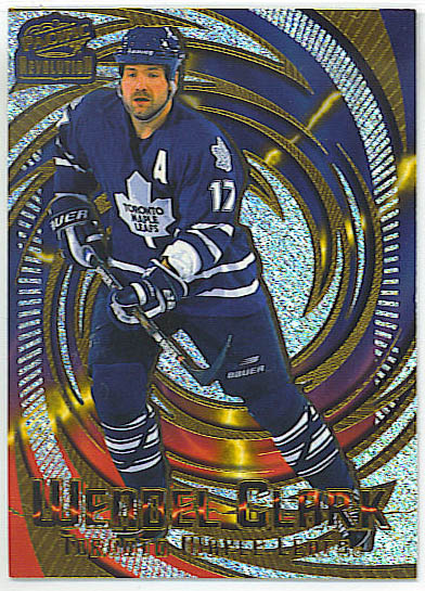
It also seems that there's some kind of electrical short in the player name, as something is arcing right across it. Hopefully the player is always recognizable from his image, because the name is basically illegible.
Sadly, with such a bold front, the card back is 90s-meh. They've come through the back of the vortex and wherever they are, it's freezing. I suppose that's better than the alternative. I've taken pictures with a mostly-frozen camera. The effect was similar. Otherwise, it's a bit of a let-down. This is probably very similar to every other back they made that year.
 |  |
So to review against the aforementioned elements:
1. The player image dominates the appearance of the card - no, can't say that it does.
2. They use bright and vivid colors - gotta give them this one. It's certainly vivid.
3. The cards have defined borders - that's full-bleed, though it might actually be my eyes that are bleeding.
4. The player and team names are easily readable - both "TOs" in Toronto are legible. That has to count for something.
5. The card numbers on the back are easily readable - yes. Hooray! They're just boring.
So this scores a two out of five. That's not really a pass, even in Gary Bettman's NHL. I'm not really compelled to get any more of these (although I do have the rest of the Leafs - Igor Korolev is best poised to escape and survive).
Now, at the same time I bought the Revolution cards, I stumbled across these:
 |  |
I'd never seen this set before and I never had either Leetch or Francis in a Leaf uniform. Perfect Leaf of the Day material! I snapped them up. They're basically an homage to/rip off of the 1976-77 Topps/OPC set. The image is a tad grainy, which presumably is a retro thing, even though the originals had much better printing. That said, let's see how they stack up:
1. The player image dominates the appearance of the card - yes, I'd say so
2. They use bright and vivid colors - not really, though part of that is the dark blue of the Leafs. Conditional pass. It's not ugly.
3. The cards have defined borders - yes, nicely done as in 1976.
4. The player and team names are easily readable - very much so.
This is pretty good! Probably a 3.5 out of 4 so far, right? I have to say, I find them kind of classy-looking in a well-executed retro kind of way. Let's check out the back. The original back in 1976 was a pretty horrid green and kind of nasty to read. Presumably they'll have fixed that. Let's flip 'em and take a peek, shall we?
Oh, my word....
 |  |
Now, while this is certainly true:
5. The card numbers on the back are easily readable
I have to say that in all my days I've never seen street slang or smack talk on the back of a hockey card. I'm not sure precisely what demographic this is targeting - youtube commenters, maybe? The "Philadelphia" thing on the front is the name of the subset - is it named after the cheese? Because cheese is one of the things that comes to mind.
Look at the Leetch - "Hockey fans will, like, get all misty when Brian decides to hang up those cool skates." Did people still talk like Valley Girls in 2004? I must have missed out on that. I missed out on "groovin'," too, but I missed that in the other direction.
For Francis, "nowheresville." Again, did anyone ever really use this in a sentence? And mean it?
I note that this is Pacific again. When Panini got the license to make cards for this season, a lot of people were looking forward to the return of Pacific. I presume it wasn't for the subsets.
This set rates about a 4.5 out of 5 on the good design scale and yet it's absurd. The design principles have been met, but the content is, like, nowheresville. At the same time, there's something about them. It's a lot like my grandparents' dog. These cards are so incredibly awful that they're kind of endearing, maybe even fascinating. I want to get the rest of them, just to see what kind of stupid things they put on the back of the other players.
"You go, Jer! Roenick is da BOMB!"
"Don't mess with the Mess, man, he'll mess you up!"
"W00t!"
The possibilities are endless.
If only these backs were associated with the Revolution fronts, this might be the greatest bad set of all time. It's something to aim for.
Comment Navigation & Markdown
Navigation
cc to focus on comments section
c next comment
x previous comment
z next unread comment
Inline Styles
Bold: **Text**
Italics: *Text*
Both: ***Text***
Strikethrough: ~~Text~~
Code: `Text` used as sarcasm font at PPP
Spoiler: !!Text!!