
The beta period for PPP Dark Mode has begun. Here's what should happen:
The first time you visit the site, PPP will choose which theme to show you based on your operating system settings.
 Whitson Gordon
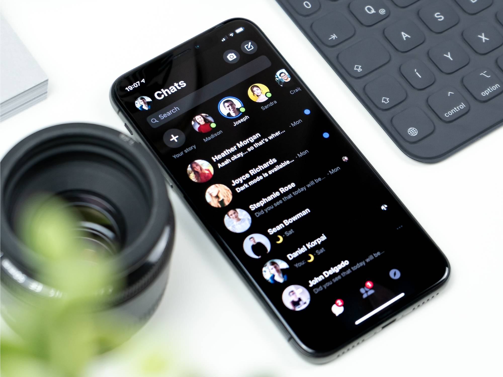
If you want to change from this default, scroll down to the footer at the bottom of any page, and you will see a set of switcher buttons that allow you to choose light or dark as your preference, or to allow your OS settings to continue making the choice for you. Whatever you choose will change the theme (if necessary) and that choice will be saved for you. The next time you load a page or go away and come back to the site, you will see light or dark depending on that choice.
Note: this is a device-specific setting, not an account setting. You can choose whatever theme you want for whichever device you are using, and the choice should be stored for you as long as you are allowing functional cookies (you have to do that to make comments work).
Changed your mind about your choice? Hit the button. Want to switch just to look around? Hit the button and then hit it again when you're done.
Why didn't I do a cute little button in the header with a sun and a moon? Because I hate those, to be honest. Text gets translated, iconography doesn't and isn't universal, and the three-choice theme picker would have required a checkbox pop-up and all of that is just more complex than what will become a set it and forget it thing for most users. Or never set it, considering the default site theme follows your default system theme.
Global Changes
I did a code cleanup during this process and removed some old scripts and HTML that was not being used. If I broke anything, I haven't found it, but if you see something strange, let me know.
That's the basics, for more on what to expect on each theme, read on.
Light Theme Changes
There are some relatively subtle changes to the light theme which you may not really notice. Stay here for the details or skip down to the dark theme section.
PPP runs on a paid theme made for a Ghost blog that I purchased when I started building the site. All the pages and page styling (the HTML and CSS as well as JS) arrived as a finished product. Ghost allows extensive customization, and all themes are open to the user to change to suit themselves, and I've added a lot to it over the months from inception.
The theme I chose, World Times, is highly customizable, and doing that customization back when I began took a lot of my time. I had to climb a learning curve very rapidly – and I had some much appreciated help – just to do basic changes.
If I'd know then what I know now...
The theme is structured in a very simple way using variables for the colours, six main ones and a few extras. There were three shades of grey: mid grey, mid-dark grey, dark grey as well as white and black. The idea here is that if you want to change the accent items you can alter the white and black. If you want to change the colours of most text elements, you can alter the three greys.
Just one problem. The mid-dark grey is the main text colour, and it was too light. I couldn't even cope with looking at it in small doses. So I did a quick and dirty (grey) fix and made it and the darker grey much darker. The result of this was making an existing weakness in the theme worse. The darkest grey is very hard to distinguish from black unless you're looking at large blocks of colour. When I was done, the black elements and all the shades of dark grey were effectively the same colour.
Text should be black. Sorry if that's doctrinaire and counter to the modern puck-moving web designer who likes his pale greys, but text should be black when the background is light.
As I built the dark theme, it became really obvious that, in making all text black-ish on the light theme, I'd taken away some user experience value in indicating the current page in the menu or identifying things as links when they weren't styled blue. I did two things to address this you will now see on the light theme: I made the text actually black, full on #000000, and I made what had been designed to be a darker grey a shade light enough to be used next to it, meet accessibility guidelines, not give me a headache while providing some visual cues to the user about how things worked, so you don't get headaches either.
This is breaking a "rule" of design because now the headings are sometimes lighter than the text, and... I don't care. Their meaning is conveyed fine with the font, the font-weight and the font-size. Form follows function, and the function of most design choices related to typography is conveying meaning, not looking pretty or conforming to what is cool these days.
Dark Theme
Now for the fun stuff.
The theme is built around a blue-tinged dark background, not-quite-white text, and a version of the "brand colour" of blue for accent and link colours. One of the fun things about the dark theme was not having to saturate the blue of the link colour so much to get it to show well and the result is a more cohesive looking style without sacrificing the main job of the colors (conveying meaning to the user).
Now for the honesty.
Everyone has their personal taste. I want feedback, but "I think the background should be such-and-such because I like that colour better," is fine if you need to get that out there, but I'm not acting on it. "I can't see such-and-such well enough," or, "This page has black on black, what did you do?" will get action.
There are some limitations I can't overcome: the search box, the sign-in pop-up and the floating icon are all inaccessible to me to style at this time. There is a request in to make them customizable at some point, but that may not happen.
Now for the technical rabbit hole which is for anyone interested in how this was done. If you're not into that, skip to the section on Comments.
How it Was Done
I'm not claiming this is the best or the only or even the final way this theme will be implemented, but here's how I did it. First a request: Please don't give me instruction on how I should have done this that assumes server-side access. I don't have that. I also chose with malice in my heart to ignore the "pure CSS" cult because if you disallow Javascript on your browser in 2023, well – shit won't work right, that's just how it is.
To begin, the theme is built with SASS and, as anyone would do if they were building a theme with only a light mode, they used SASS variables for the colours. This allows you to plug the variable name into any CSS declaration involving colour, and you can even insert it directly into an rgba declaration or use the lighten or darken functions on it. All of these usecases appeared in the theme styles.
Because SASS variables are compiled in the build process they are static, you can't just declare a second set of colours for them. And that means two roads lay in front of me:
- rewrite all of the CSS that involved colours as a dark theme – so finding it in about 10 different documents, copying it and then plugging in new colour values in each declaration. This was totally impossible since the CSS was written SASS-wise, so the only real solution was to just do a completely duplicated set of CSS declarations to load as the dark theme. Or...
- do what I did
What I did was google. I'd begun with the CSS Tricks page on dark modes, and I basically just used their JS as-is for my first version.
 Adhuham
From there I went on a hunt for how to deal with this variable issue. The theme is built on top of Bootstrap, so all those unused Bootstrap CSS variables for colour were sitting there. I wanted more of those! CSS variables are not static, so you can simply make two sets of colours – one for dark and one for light. And I started on that using this delightful article that shows you how to convert one to the other...
 Dominik
But then I said, wait, wait. What about all those rgba declarations? I can't stick a CSS variable into those. Oh, no! I have to recalculate all those colours and make Dark Grey Only With an Alpha of 9 and Dark Grey With 8 etc. etc. , and then if I change one colour, I'm changing eleven million variables, and ... someone before me has had this problem. The key to starting out dumb and figuring out how to succeed is to remember this. Someone else did it and wrote a blog about it trying to leverage the synergies to monetize the engagement – or just to be nice, one of the two.

Jim laid it all out for me. A SASS function to convert hex to rgb, followed by a method of declaring the CSS variable as comma-separated numbers, and lo, I was saved. All I had to fudge was the use of lighten and darken.
The process was as follows:
- restate all the light theme colours as CSS variables using the above method
- go through all the CSS and change things like
color: $whitetocolor: rgb(var(--white));where the variable --white was set to 255,255,255 - make sure I hadn't broken anything
- make dark versions of those same variables by using the same conversion of a hex value to numbers (I did this so my code editor shows me the colour next to the hex value, and I don't have to remember what the numbers mean.)
- commence fiddling with the colours
That seems convoluted, but the result is a very short section of new CSS, and very, very few dark-theme specific CSS declarations. The bulk of the editing was a find and replace operation. Once that work was done, the fiddling was just changing a hex code in one place and deciding if I liked it or not.
This was the point at which I backed up and rejigged the light theme. And then I cleaned up the codebase to get rid of things that had been replaced with newer features.
And then I rethought the way a user would do things, did a little more reading and decided on a three-button choice and used an online example as a jumping-off point. And yes, all of that means it's a trivial amount of work (beyond the actual design) to add another theme if that seems like a good idea in the future.
Once I was mostly happy with the look of the dark theme, I had to tackle comments.
The Comments
I have fear.
For reasons mostly related to not spending money if I don't have to, I don't have a live development version of the site. I only have a local one, which means I couldn't fully test the implementation of the dark mode on the comments. I think I know what it's going to look like, but I'm not sure.
Some very minor changes were made to the light theme comments, things so subtle you might not be able to see a difference.
If there's going to be a serious problem it will be in dark mode comments. I will be focussing on that first and ignoring almost everything else.
We'll see where this goes!
Articles
Some special elements within articles don't display correctly in my development version due to some differences in the hosted and self-hosted versions of the site, so there might be some fixes needed for those things. We'll deal with those as we find them.
Aside from the limitations mentioned above about elements I can't style, embeds in articles do not support dark mode. Twitter embeds, for example, have to be requested dark to their API, so supporting dark mode has to happen server-side by the client. Twitter's API barely works regardless, so it's highly unlikely they will ever support multiple mode embeds in a useable fashion.
Feedback
Please try to keep questions or comments or whatever in this post. I may not see something you just stick in the FTB or whatever.
If it's broke, please tell me! If you're not sure, ask. Try, please, please, try to report issues with enough information that I can do something with it – include your OS setting, and what choice you're making on the site theme switcher. Also – if you routinely see the dreaded "flash of incorrect theme" I want to know about that too.


Comment Navigation & Markdown
Navigation
cc to focus on comments section
c next comment
x previous comment
z next unread comment
Inline Styles
Bold: **Text**
Italics: *Text*
Both: ***Text***
Strikethrough: ~~Text~~
Code: `Text` used as sarcasm font at PPP
Spoiler: !!Text!!