
Yesterday, the NHL’s 32nd team announced that they would officially be called the Seattle Kraken, and they also released colors, logos, and a jersey prototype. As far as I’m concerned, the name was the best of all available options; the NHL needs way more teams named after cryptids and way fewer teams named after lethal natural disasters, and the addition of a second cryptid-themed-team will only help this noble cause. (If the 33rd NHL team is not the West Virginia Mothmen, Gary Bettman will be receiving a strongly worded letter.)
But we’re not here to talk about the name! No, it’s time to talk about something way more important—the jerseys. Namely, are the jerseys good?
Seattle Kraken. Love the Space Needle anchor. Jerseys via @icethetics. pic.twitter.com/TT84styfkd
— Frank Seravalli (@frank_seravalli) July 23, 2020
My first impression: that is a classy-ass jersey for a team named after a cryptid. According to the Kraken website, which is absolutely worth reading if just for descriptive phrases like “a name that incarnates the might of the sea”, the single-S crest is a callback to Seattle’s first NHL team, the Metropolitans, whose logo was a (radically different) S. The Metropolitans did not include a negative-space tentacle in their logo, and more’s the pity, because it’s great. Score one for the Kraken on the “subtle, yet cephalopod” front.
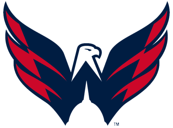
The wordmark is fine—I like the font, mostly because I can easily imagine it on the cover of a YA fantasy novel and that is a pro for me in the graphic design column, but it’s nothing particularly groundbreaking. The space needle silhouette in the secondary logo is wonderful, though, and reminds me of the US Capitol silhouette in the Washington Capitals’ secondary logo (which should really be their primary logo if they had taste, but, alas).
The Kraken’s colors themselves are also clearly chosen to, uh, incarnate the might of the sea, down to the (admittedly hilarious) names for what, in essence, are a very dark blue teal, a pale blue with gray-green undertones, two more tonally coordinating gray-blue shades of varying depths, and then a contrasting punch of saturated bluish-red.
This is the one place I’d have made some changes. Even considering that the blue is borderline teal and the primary colors are a tonal contrast—something hockey jerseys do not do enough!—blue and red is a very well-trod color combination in the NHL. I’d have loved to see them use a vivid green as a contrasting color, a la the Seahawks (although possibly something slightly less neon, which has always upset me—I’d swap in a kelly or emerald green). If someone had handed me the reins and let me do whatever I wanted, though, I’d have swapped out that red for purple. It would be very easy to pick a shade of purple that lent itself to the murky, oceanic color scheme without blending too much into the blue, and it would really make that color scheme stand out in a good way. If you are going for an aesthetic that calls to mind “the sea—the vast expanse, the impermeable deep” I think purple does that better than bright red, and has the added advantage of matching the ad copy prose.
(Seriously, though, every line on this site is a gift to me, personally. It’s glorious. Please, Seattle, always remain this wonderfully extra.)
As for the jersey itself, I like the sleeve striping and outlined numbers, and I also like the use of the contrasting piping, although I absolutely want to see what the socks and pants look like and how they integrate in the red. Contrasting piping down the sides of the pants, or, even, a negative-space tentacle similar to Tampa’s lightning bolts? Wave-shaped stripes on the socks, like the NWHL’s Connecticut Whale? I’m very curious to see what they’ll do.
In the name of science, I asked the rest of the masthead for thoughts:
Hardev: The wordmark looks like a rum bottle, so that’s both a plus and a minus. I love the “S” logo with the tentacle and the red eye, plus it has a degree of symmetry that’s really appealing. It looks mean, which I love. As for the colour scheme, they need to go harder into the red. It’s such a good contrasting colour and it would really make the jerseys pop. The deep sea blues are all spot on. When this logo was revealed I went over and looked at the rest of the logos in the league. I’m sorry, Anaheim, but your duck logo is so embarrassingly bad, you’ll need a rebrand if you’re going to be in the same conference as This.
And because I was curious, I took out the colour on all the logos. The monochromatic versions all look incredible as well.
Katya: I love the mix of classic styles with clever modern twists in all of the jersey elements. The font on the S looks like it could have been on an original six team, and yet it has a pulsing red eye. The anchor looks like the most popular tattoo of 1953, but it has its easter egg inside. I would love to see that easter egg idea continued in some other flourishes, but I still am sorry that the original even more aqua colour and its perfect compliment shade of pink were a feint to draw us off the scent of the sea monster. That red shade is wrong to me because it’s not that pink. But overall the mix of pop culture, serious design, desaturated eighties colour and a logo far less cartoonish than we maybe had a right to expect is unique and also fitting. You won’t look at this team on the ice with Boston or Montréal and think it looks like it’s from some other league like you do the Sharks or the Penguins. Now all this multi-national hockey league needs to do is sort out the correct way to pronounce Kraken.
Species: It’s contemporary in the right ways without being overboard on the schlock (so far) one could use with a reference like “Kraken.” I like it. The potential for the in-arena experience is good. I like the colours too. Red Alert? Well the Borg would be the kraken of the 24th century. Set course for Seattle and... Engage!
Brigstew: What I don’t like — the wordmark. Whatever, it’s meh. I don’t appreciate jerseys for their font design. What I like, with a caveat that I think parts could be better — the overall colour scheme. I like that they went more teal than regular blue, since lord knows there isn’t enough blue colour schemes in the NHL. What I wish they did was went in a more unique direction. Annie mentioned purple, and I hadn’t thought of that but I think that would have been a great accent colour too. My initial thought was using a salmon-y pink as the accent, and maybe it works better with the lighter teal than the darker one as a primary colour. What I love — both logos, and actually maybe the secondary one the most. The space needle top for the anchor was a nice touch. In fact, it’s so good that a lifelong nerd with no interest in sports and lives in Seattle (and is one half of Penny Arcade for you gamer nerds that might know him) might become a hockey fan because of it. A logo that can make non-sport fans into hockey fans is doing its job right.
Can a logo make you like a sport...? Because this logo is giving me feelings. https://t.co/Lq3rCONo6b
— Tycho Brahe (@TychoBrahe) July 24, 2020
Arvind: Overall, I like it. The Kraken name is kitschy, but this is sports! Things don’t have to be serious and angry and grimdark all the time. They’ve done a good job not going too far with the kitsch by producing a genuinely good set of jerseys and logos. Others have commented about the strength of the logos, both primary and secondary, so I won’t add much there. They’re clean and clever, incorporating tasteful local touches and relevant references to the name. Pairing blues almost always works well (Columbus has done this to brilliant effect) with their third jerseys. If those were the Blue Jackets’ main jersey, I’d say that the Kraken one is too similar. Luckily for the Kraken, it’s not, and frankly, Columbus is so much the worse for it, because their current set of jerseys is terrible. I agree that the addition of red doesn’t do a lot for me. A murky green would’ve added to the nautical theme, as would the purple that Annie suggests, but that’s not an enormous issue. Overall, a solid 8.5/10.
Comment Navigation & Markdown
Navigation
cc to focus on comments section
c next comment
x previous comment
z next unread comment
Inline Styles
Bold: **Text**
Italics: *Text*
Both: ***Text***
Strikethrough: ~~Text~~
Code: `Text` used as sarcasm font at PPP
Spoiler: !!Text!!