

Today the NHL unveiled its portal to puck and player tracking data that is open to the public. The overview of what it offers is here:
They begin with a set of six short videos that introduce in a very general way what the actual information will show to users. The videos are presented in marketing language with an "I've been to broadcasting school" mimicry of excited play-by-play. The attempt to make dry discussions of measurements of player and puck movement into Excitement! Drama! Thrills! and Chills! descends inevitably into implying significance where there is none. But that's the trailer, not the film. To really dig into the film and what its story is, first, like all good nerds, I'm going to go back and talk about the book it's based on.
Manual Statistics
The NHL has always produced statistics, and in the early modern period of the NHL – the post expansion era – those statistics were very much what you would see today on a site like Hockey DB or Elite Prospects.
These numbers come from official scoresheets, and as you can see, the format is fairly universal in the hockey world. There's more information collected than shown above, such as TOI and SOG. In 2007, the NHL added shot location to the data the official scorer collected. And the information has remained largely static since then.
The process by which the official scorer collects this information has changed over the years as well. And there isn't one person, it's a group of people. But as we learned a few years back when a change in equipment introduced a systemic error, the x/y coordinates that are recorded for shot location are done on a tablet-like device manually. Someone taps at the location on a schematic of a rink where they just saw the shot taken. Shot type is also recorded, along with player shift changes and shift entry locations. The entire set of data is a list of events with various properties defined by humans. So it's not really manual, it's all done on computers and is available in real time, but it's human-created.
If you want to look at it, you don't need to build a web scraper, Moneypuck gives the data away in easily read spreadsheet form. Download some and have a look.
This source data is the single progenitor of most of the hockey data you will see produced outside the NHL. Sites like Evolving Hockey, HockeyViz, Natural Stat Trick, Moneypuck and anyone producing visualizations of information from those sites are all manipulating the same source information.
Clan Corsi
The introduction of shot location to the data in 2007, allowed, in time, for the analysis of thousands of data points about shots and their outcome. (As always, when I talk about shots, I mean all shots, not shots on goal.) This became Corsi, and latter, that evolved into Fenwick (all unblocked shots), and the entire family of Expected Goals (based on Fenwick) from any number of models created by private individuals. Expected Goals gave rise to goalie measures like Goals Saved Above Expected and shooting measures like Expected Fenwick Sh%.
All of these statistics arise out of the tap on the schematic that records the x/y of the shot location. They are all human-measured and they are all of the same origin. Criticisms of this data for being error-prone are valid, and the less of it you look at – any given shot on one of Moneypuck's charts, for example – the more chance you're going to see human error mixed in with professionally competent recording. In big doses the data gives us things like the following graph from eight years ago, the errors fade away to insignificance.
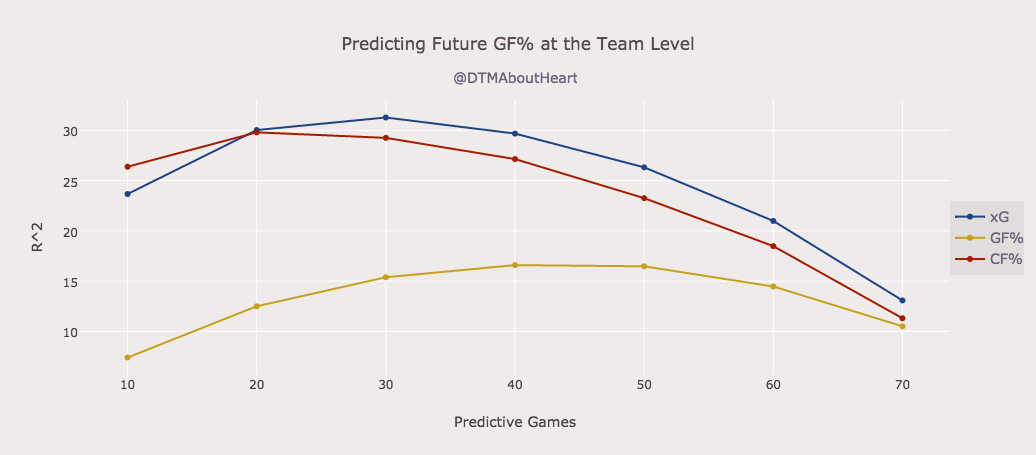
Corsi, and its clanmates are proxies for possession. Before there was robust analysis to back it up, hockey people were familiar with the idea that having possession of the puck more than the other team makes you more likely to win. The levels of resistance to this truth are astonishing, if you take a step back and consider it dispassionately. It should be one of those things that doesn't need a proof. And then I look at the handle of the person who made the graph again, and I remember that hockey is pure emotion for a lot of fans.
That Tie is Ugly
Consider the NHL suit parade.

The tie hangs crooked, it's a little wrinkled, and it fails to make that shirt work with that suit. Let's say for the sake of argument that that tie is objectively ugly. Does that mean John Tavares is ugly all the time? Does that mean all his ties are ugly? What is the significance of this fact about the tie, and can we use this fact to learn anything about the future of John Tavares? Will he be ugly in the suit parade Tuesday in Washington?
These questions are the driving force behind the years – nearly two decades – of analysis of NHL official statistics. Does it mean anything, where and in what context. Much of what we have and use is purely descriptive, some of it is predictive like that graph above that shows various measures that predict future game outcomes.
Many people have been extremely excited by the existence of player tracking data, and have high hopes for an expansion of understanding from analysing it. I've always been skeptical of this, and have never expected the NHL to release useful information in a manipulable form to private individuals. So I go into my first look at Edge with two thoughts: How much of this is "that tie is ugly" stuff, and also, why the hell did you name this after the browser everyone hates even though it's actually kind of good?
Edge
The intro videos on the edge site are likely worth your time, but they are very like a movie trailer. You will see the way this tracking data is collected: there are chips in all player jerseys and in all pucks and there are cameras in every NHL rink that record the location of the chips at all times.
I noted one night that the Leafs broadcasters were able to check some data they have access to in order to identify which player was missing from the bench. What this data cannot do is solve an offside question or tell you if a puck crossed the goal line with accuracy. There are no sensors in the posts or the blue line locations to allow that level of precision.
What Edge is making available to you is:
- Shot Speed
- Shot Location (in a way)
- Skating Speed
- Skating Distance
- Zone Time
The Trivial
I'm going to dismiss skating distance out of hand. It's a silly bit of trivia that gives you a chart like this:
and no one producing this either knows or cares that it's a proxy for ice time. The top guys from prior seasons mentioned on the video are big-minute defenders on bad teams. The top guy this year, pictured above, is Seth Jones. The zone percentage is mildly interesting, but available in the zone time charts.
The (in)significant
Skating speed is one metric where the intro video really sells hard that it's meaningful, but here we are with the crux of a problem. Maybe it is valuable in some way – they measure max speed and number of bursts of speed produced, which is another proxy for ice time to some extent.
This data only began to be collected in 2021, so there isn't enough priors to analyse the value of descriptions like this. Until anyone can claim – outside of a mystical or "I just think" narrative – that it's repeatable, significant and/or predictive, it's just fun.
Shot speed is in the same boat as skating speed. You can learn from the video that the farther you get from the net, the more the shot speed climbs, but aside from their valiant attempt to make slap shots relevant in the video, that's all you know. It comes in handy later, though, when you're forced to use this as a proxy for shooting distance in some of the team information.
Player Data
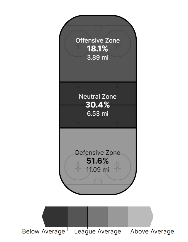
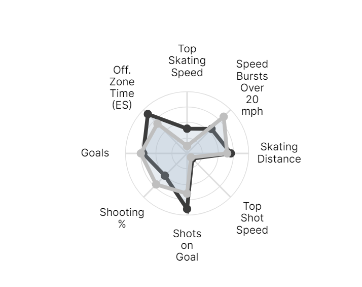
If you look at individual players, you get a dashboard (naturally) that gives you data on the player, the league average and what percentile the player falls in. This information is then repeated in a radar chart, their default view of most information.
I picked Max Domi, a player I have concerns about, to look at what I can learn.
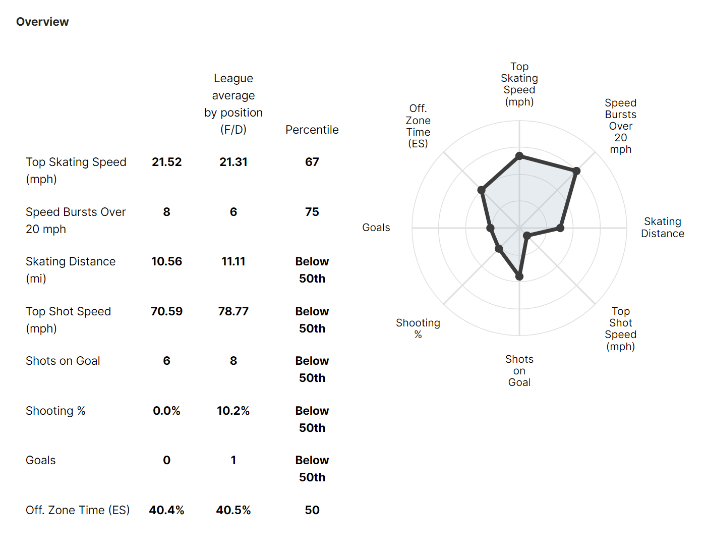
If you like, you can look at shot speed being low and be proud that you've found a thing he is "bad" at, but have you? The most interesting thing here is the new proxy for possession that is zone time. The detailed charts below this overview will show you all three zones as a percentage and as a percentile.
The knock on Clan Corsi as a possession proxy is that it doesn't measure time spent while no one is shooting. So the complaint is that a team may pass the puck a lot and actually have possession a lot, but shoot more judiciously than a team with the same Corsi %. The problem with zone time is that it measures the puck location, and so doesn't distinguish control. One measure is missing some things at both ends of the ice, one adds some things.
Is zone time better? In time, we'll know, but it's one of the aspects of this data that's presented well, and actually tells you some things right on the player page that is useful. Eventually – the site is very slow right now.
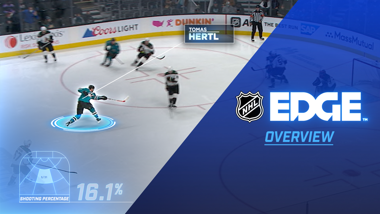
The shot location data could be glorious. This is how it's presented:
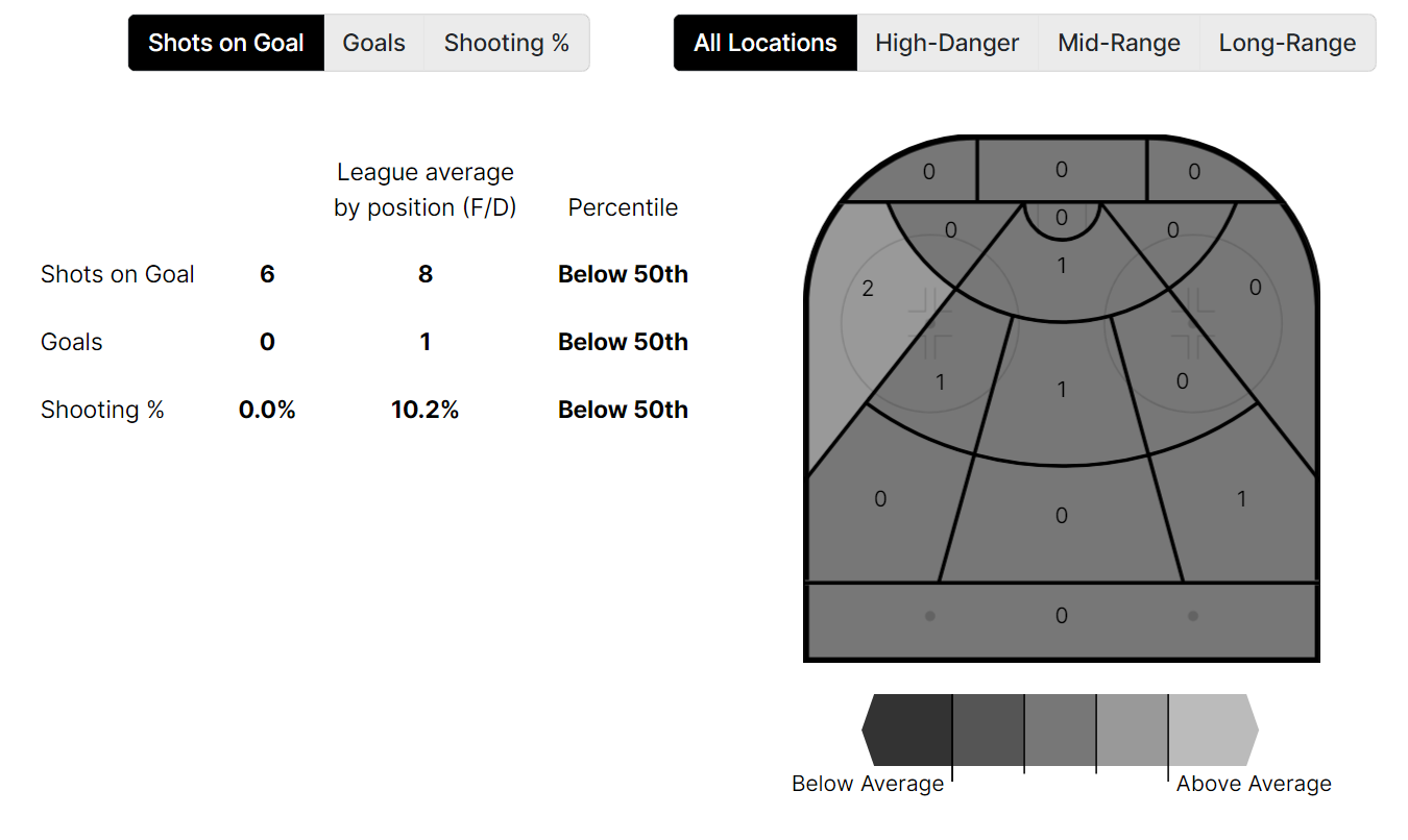
It's Shots on Goal. There is no excuse for using SOG. None at all, and it is the worst part about this presentation. Shooting is not about where the puck ends up! It's about where it begins. It's about the player's choice to shoot then and there and how often. Use this for goalies – which have a similar chart – and I'm all in. Use this for shooters when you went to all the damn trouble with the chips and the cameras and the server farm, and you should be ashamed.
Take a longer look at that overview and tell me what's missing. When you realize that there is nothing beyond zone time that even hints at defensive activity even taking place, you realize this is just a gloss on the points-focused presentation of hockey data that has existed since the time before we understood how limited that is.
Team Data
There are team-level stats too, and the most interesting use of them is via the Comparisons tab. You can compare a team, oh, any team you like, from one year to the next. You can compare players too, if your heart really desires a look at how hard each one shoots the puck, but the team information is moderately interesting. The same caveat applies, no one defends in the universe this data measures.
The details show you the zone time breakdown plua a lot of trivia. If you want to see SOG locations graphically, this is where it lives.
I was going to show you our matchup tomorrow: Leafs vs Capitals in this form, but this site is just too slow. It's funny, though, if you patience go look it up. But then I wondered how misleading it would be to show the Leafs vs the Islanders and just compare offence. All truthful and more accurate than anything those other sites have, but is it telling you a meaningful truth?
Conclusion
After a first quick look before I got impatient with the load times, I found the zone time information interesting, and a longer more thorough look at goalie charts might reveal some value there.
Almost nothing else means anything, or is likely to gain meaning with more data-years to analyze. I looked four times figuring I'd missed goals or SOG against on the team pages.
I am absolutely at a loss as to how that page on Max Domi tells me a damn thing to make me understand him.
Sadly my skepticism seems well founded, although the NHL is teasing that "even more" information will be released. And honestly, maybe the biggest surprise here is the lack of faceoff data and plus/minus in some souped up form.
I don't think this can be said to be the NHL dumbing things down so the fans can understand it. I don't think this is the NHL even trying to be misleading because their gambling partners won't like it if this data (which they have all of) gets used to help the rubes bet. I think the decision makers in the NHL don't have any idea that something can be accurate and meaningless. Neato and insignificant. True and trivial.
I'll end this with the final word. Nothing here really matters to me.


Comment Navigation & Markdown
Navigation
cc to focus on comments section
c next comment
x previous comment
z next unread comment
Inline Styles
Bold: **Text**
Italics: *Text*
Both: ***Text***
Strikethrough: ~~Text~~
Code: `Text` used as sarcasm font at PPP
Spoiler: !!Text!!